

STIGA: company website and online shop for a garden equipment brand
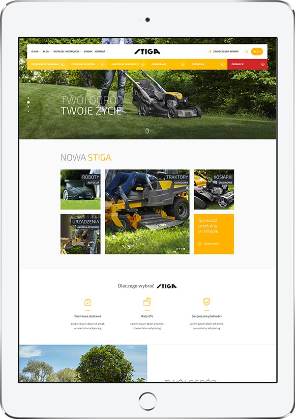
STIGA is one of the best-known garden equipment brands in Poland and a client we have worked with for 14 years. We designed and built the brand’s Polish company website combined with an online shop: a large product catalogue, clear category pages, detailed product pages and a cart designed to sell complementary products.
- Client
- STIGA
- Industry
- Garden equipment – manufacturer
- Website
- stiga.
pl
Scope
In this case study
Who is STIGA?
STIGA designs and makes garden equipment: lawnmowers, robotic mowers, garden tractors and hand-held tools. In Poland the brand sells through a dealer network and its own online channel. Almost anyone with a patch of lawn knows the yellow and black machines.
Challenge: a very large catalogue that still reads as one product
Hundreds of products and a lot of content on one site.
A combined company website and shop with one navigation: product lines on the home page, categories with filters, then product pages.
Products that differ in details customers compare.
Product pages with a specification table, standard equipment, tabs and recommended products, so the customer can compare models without leaving the page.
A shop that should sell more than one item per order.
A cart that suggests accessories and higher models (cross-selling and up-selling) at the moment of purchase.
Solution: key features
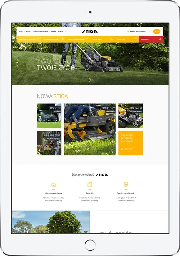
Home page with product lines
Tiles for robots, tractors, mowers and tools lead straight to the right part of the catalogue, with a promoted product line and the brand’s seasonal campaign on top.
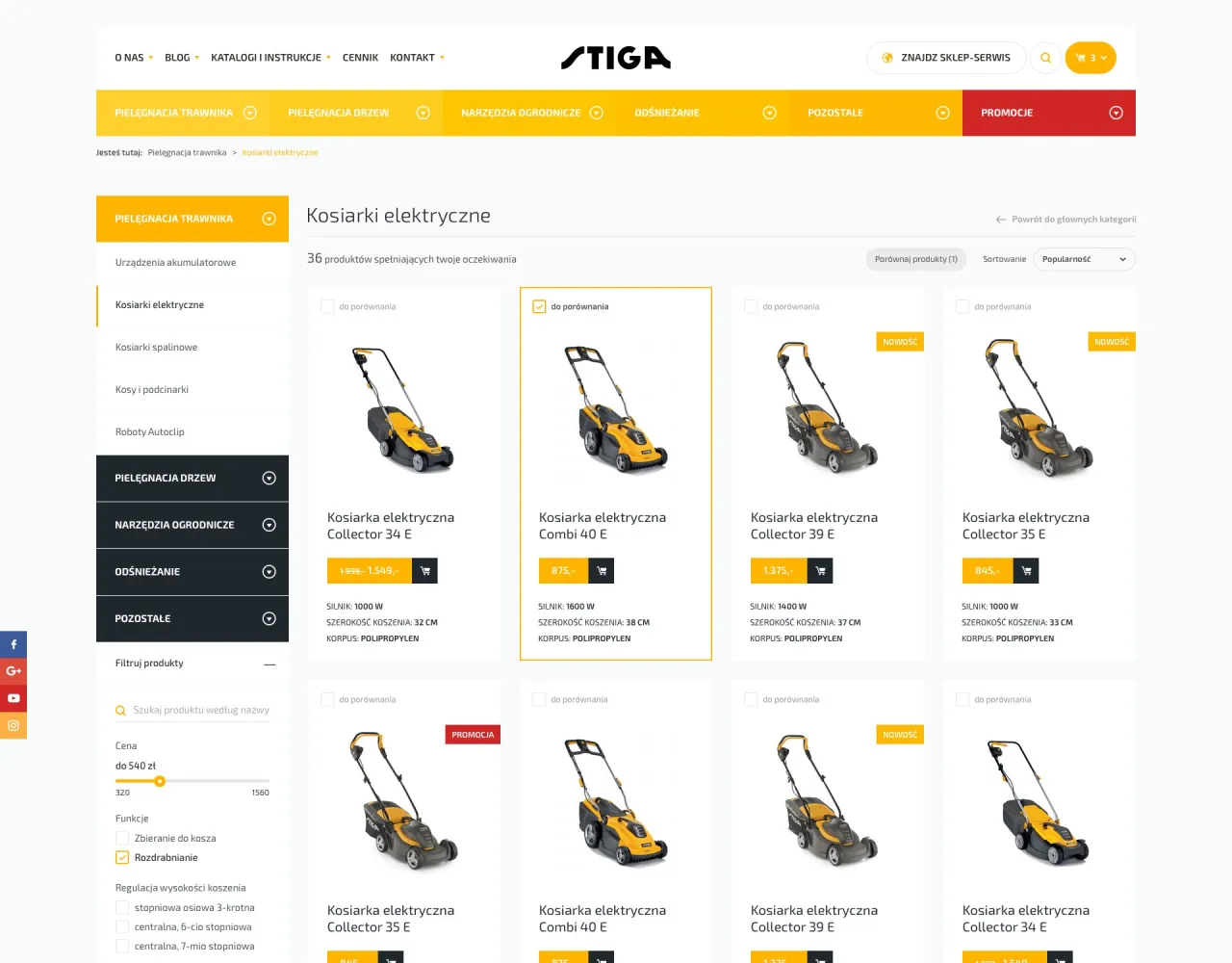
Category pages with filters
The lawnmower category shows products in a grid with price, rating and key parameters; filters on the left narrow the list by type and features.
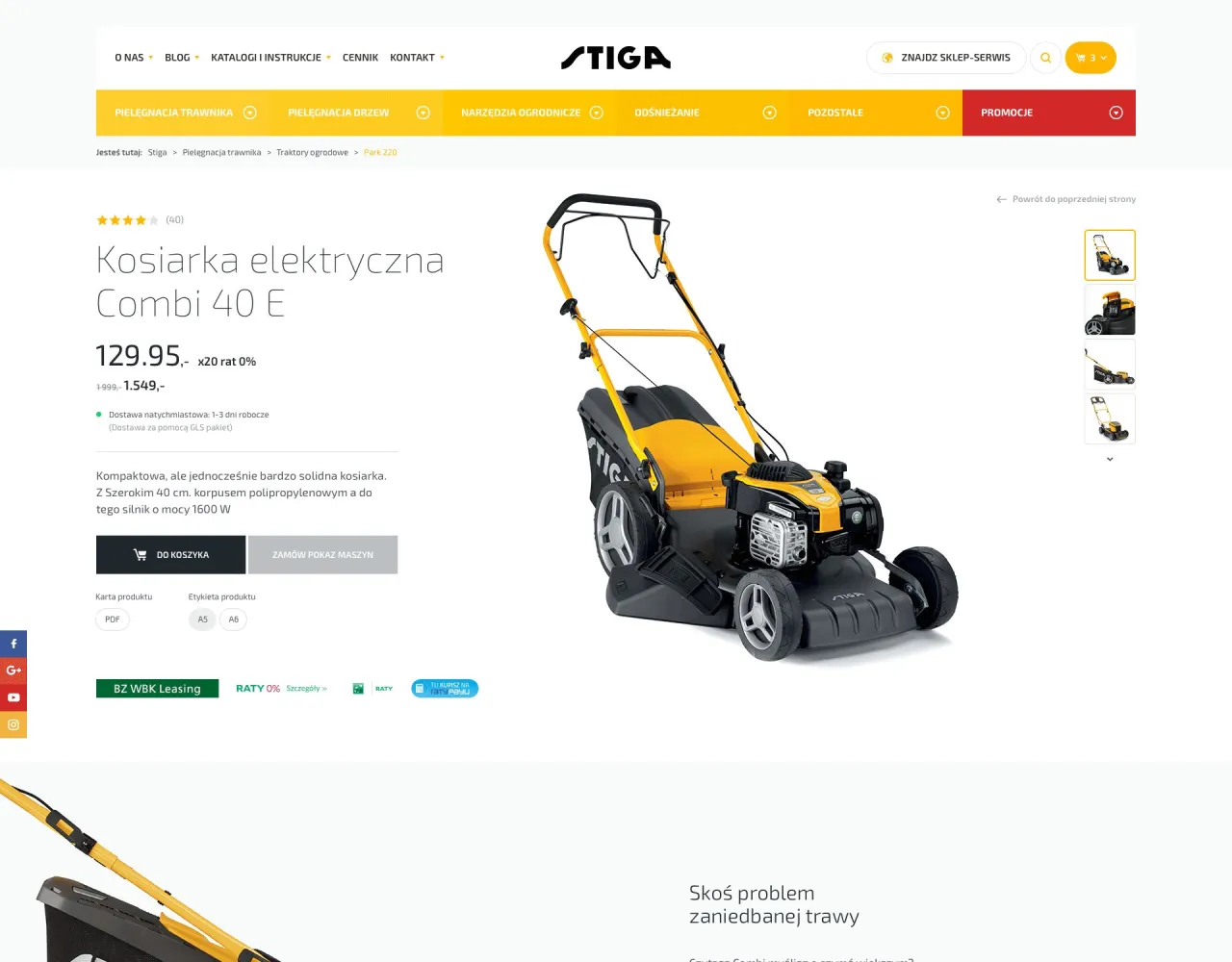
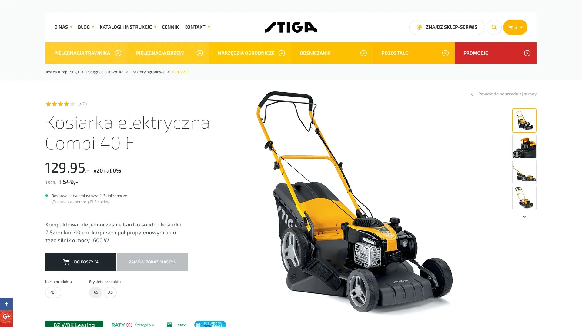
Product page built for comparison
Price, rating, a short description and a photo gallery at the top; below, highlighted features, a specification table and standard equipment.
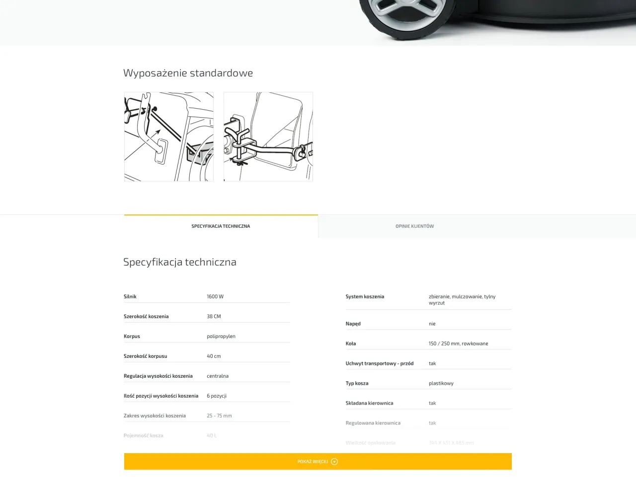
Specification and recommended products
A specification table and standard equipment answer comparison questions on the spot, and recommended products at the bottom of the page lead to accessories and other models.
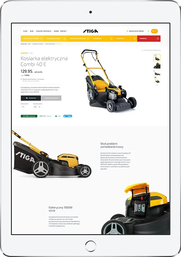
One visual language
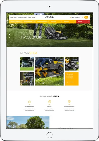
A clear layout in the brand’s yellow and black, consistent on desktop, tablet and phone.
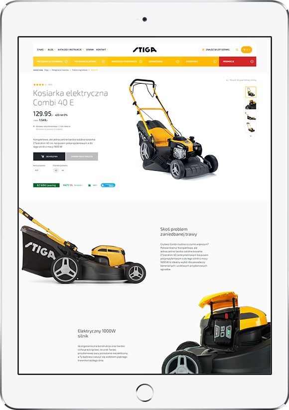
More screens

FAQ

Do you make products and want a website that sells them as well as it presents them?
- Tell us about your company and what the platform should do.
- We will discuss the scope and propose a solution.
- You will get a free estimate within 24 working hours.
